DataDog OBSERVE
For DataDog’s flagship 2023 OBSERVE Conference, I was brought on to lead the creative concept and develop the core illustration style that defined the event’s entire visual identity. The goal was to transform complex data observability concepts into an approachable, visually striking artistic narrative that resonated with developers and tech leaders alike.

Working closely within Datadog’s established brand guidelines, I created cohesive artwork that elevated the event’s unique theme while fitting right in with the signature illustration style that Datadog features in their communication pieces.
I drew heavy inspiration from Datadog’s editorial blog imagery, which utilizes bold, colorful compositions to convey intricate technical topics. The goal was to build a concept that was friendly and engaging, yet inspiring — while also having a high degree of visual versatility so the assets could be dynamically repurposed across the entire branding spectrum.
Deliverables
Core Brand Assets: Developed the master key illustration concept and built a library of highly scalable graphics for social media and web platforms.
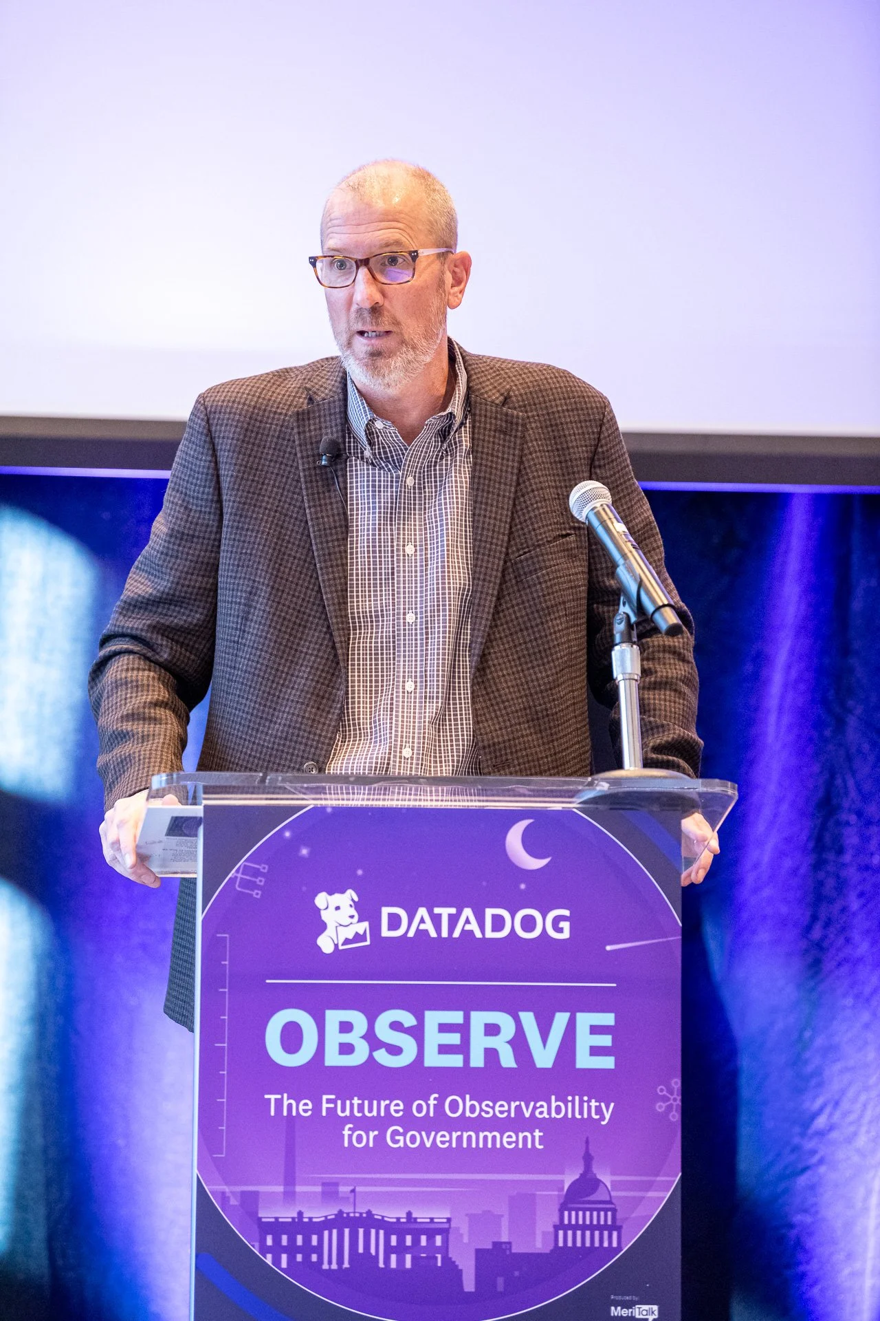
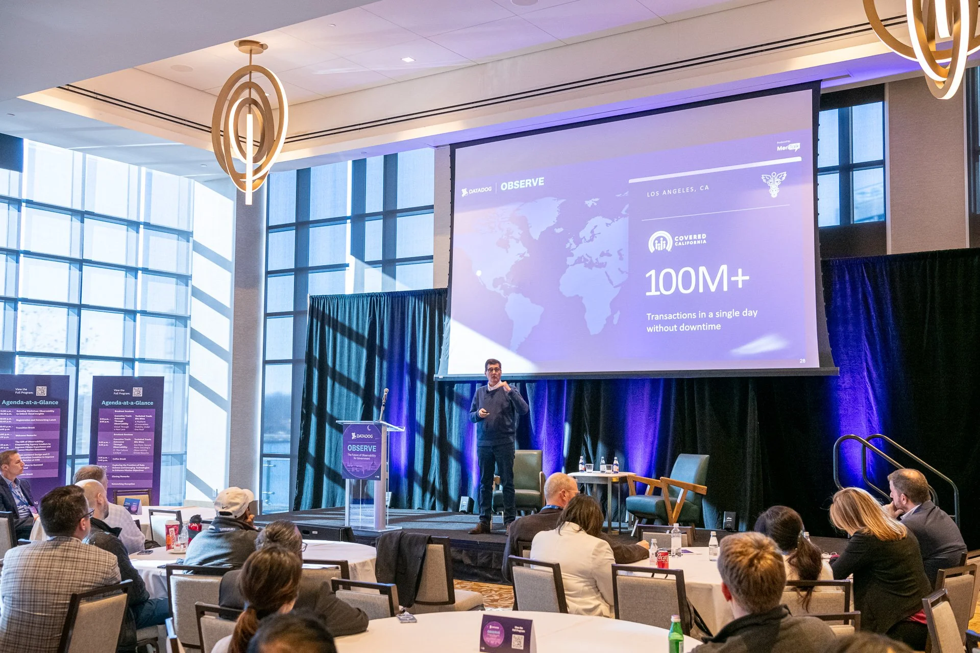
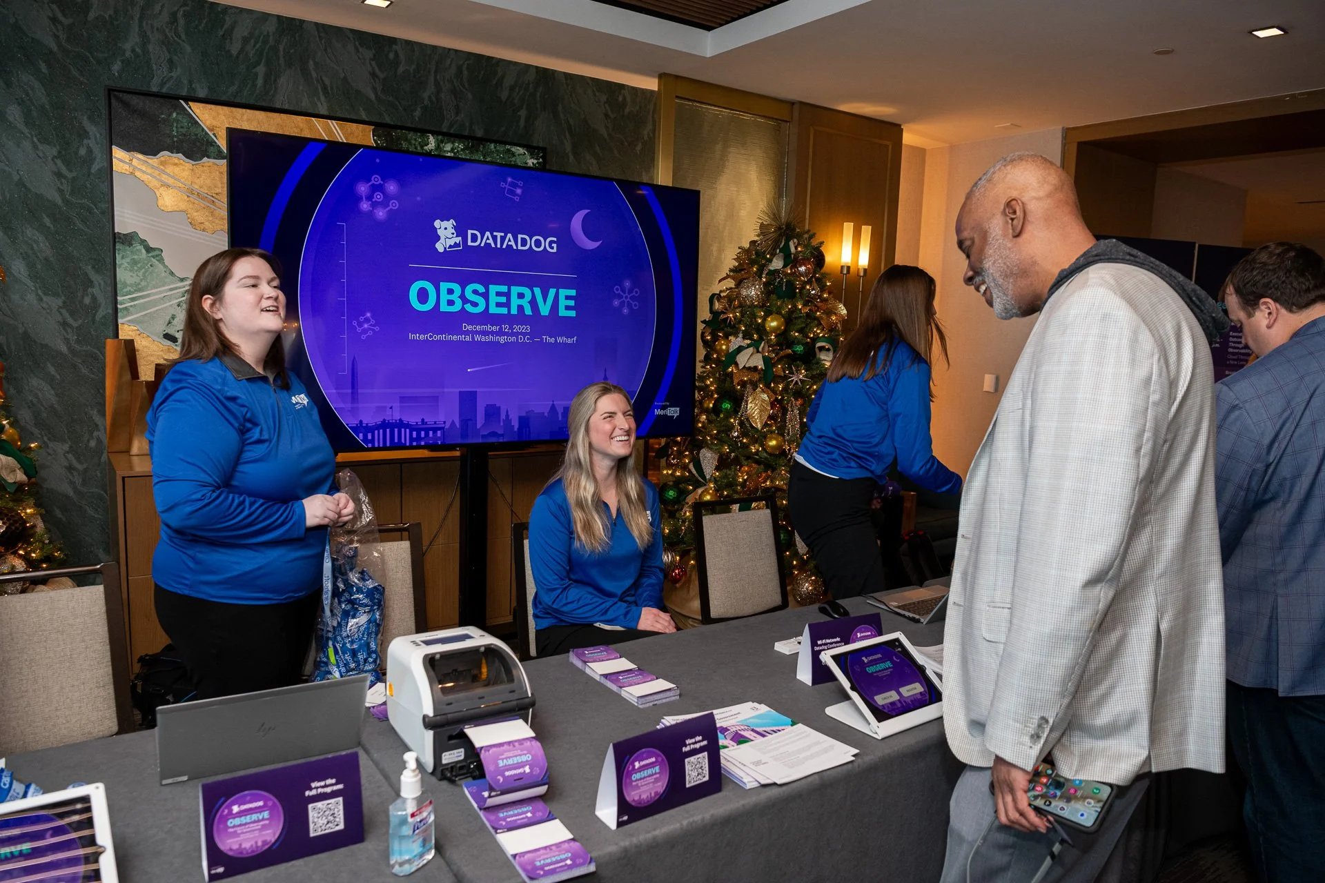
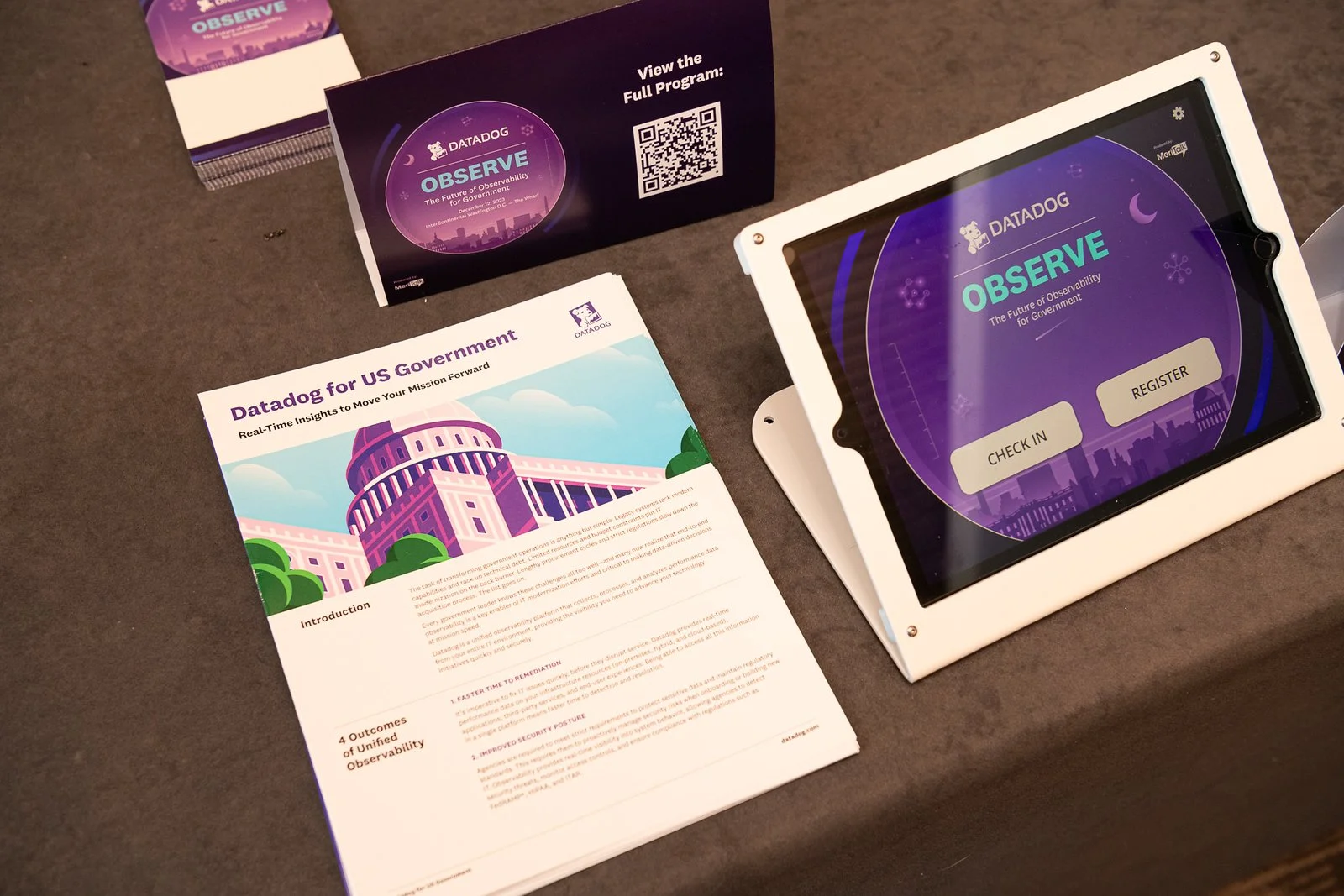
Environmental & On-Site Design: Designed all venue signage, spatial environmental graphics, and customized badge systems tailored for attendees and event staff.
Digital & Motion Graphics: Created an array of event promotional graphics (for both digital and print layouts) alongside a custom looping motion graphic that brought the visual identity to life on screen.
Keynote Content Architecture: Designed custom, high-end PowerPoint slide decks to ensure the conference's main-stage presentations felt visually unified with the broader event theme.
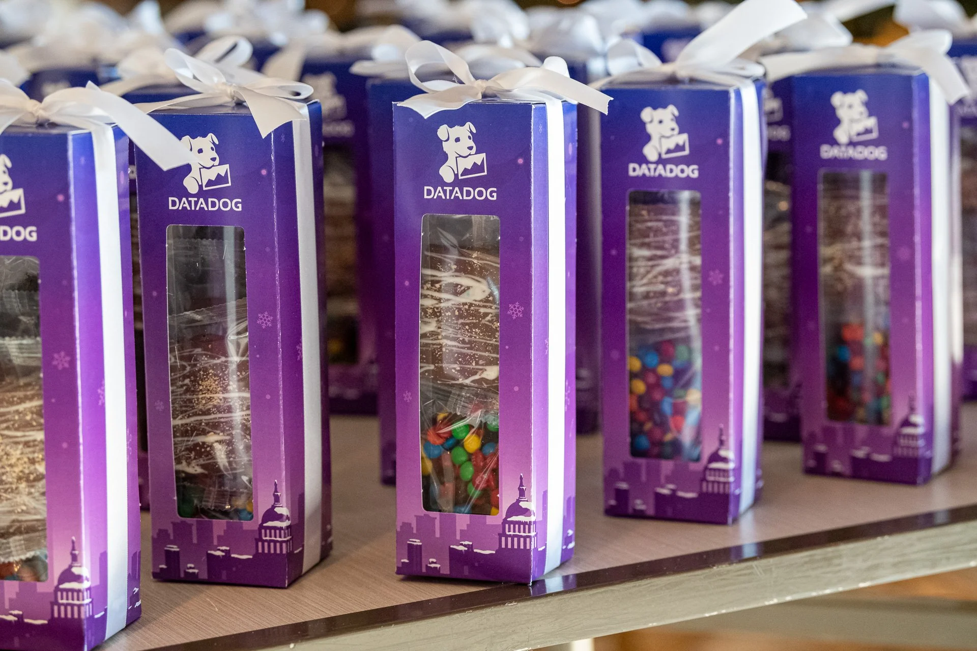
Event Merchandising: Crafted premium attendee swag, which included designing custom, thematic packaging for a special gift box of holiday chocolates.
Event Direction
Ideation
My approach involved exploring various metaphors that could visually communicate the idea of disparate data sources coming together to form a holistic view, much like the service that DataDog provides. I focused on themes of unity, flow, and insight, all while maintaining an approachable an approachable aesthetic like Datadog’s blog imagery.
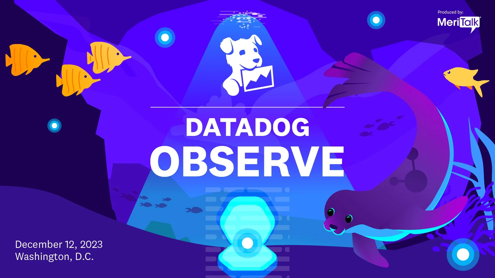
The Observer: My initial idea for visualizing "observability" came from the themes of discovery. I illustrated a curious seal navigating the depths of the ocean, finding a clam that’s shielded by some kind of barrier. In this visual, the ocean represents the vast and often unseen environment of a companies infrastructure, encompassing on-premises, hybrid, and cloud-based systems.
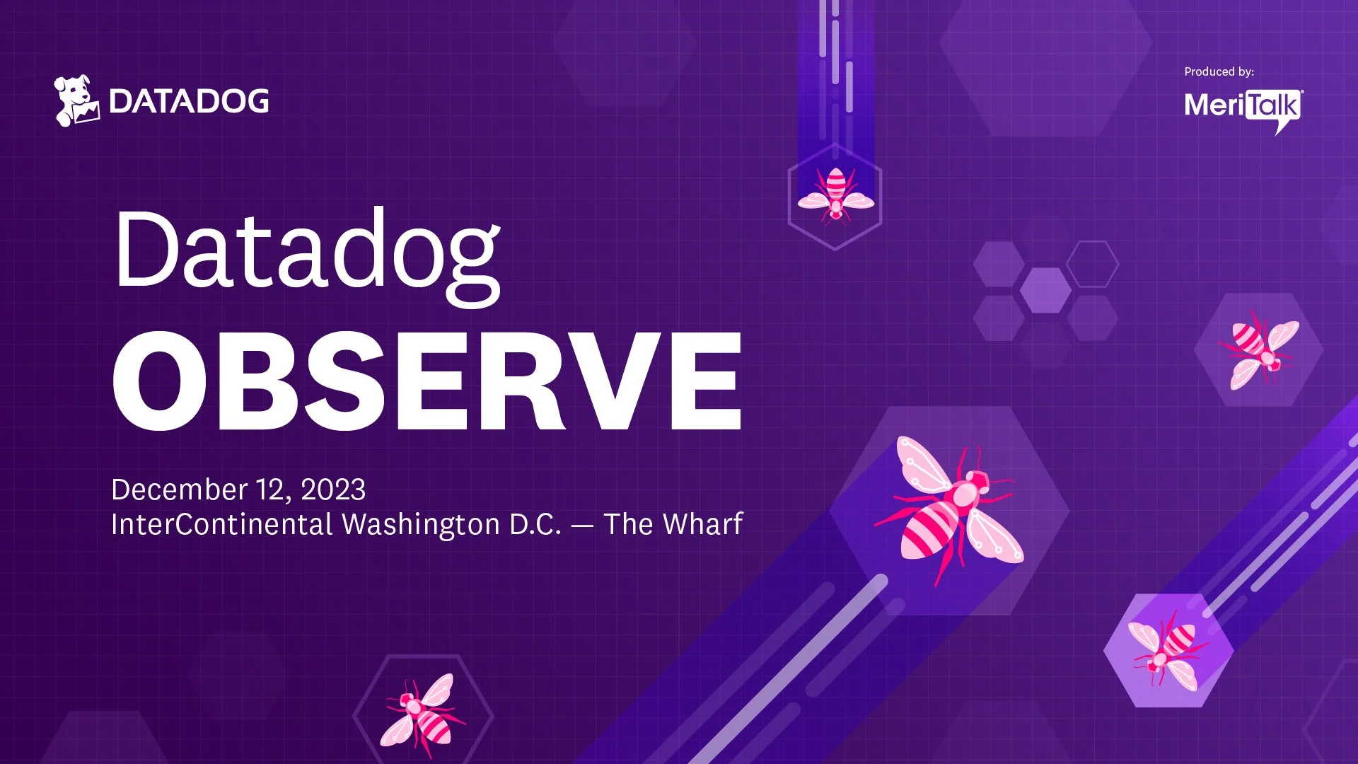
The Network: Building on the idea of interconnectedness, my second concept focused on the dynamic nature of a team within the network. The illustration shows worker bees, energetically zooming around a network of hexagons from the perspective of the observer. The bees represent the constant activity and flow of data, while the hexagons symbolize the structured, interconnected components of a network. This illustration emphasized the bustling, unified activity required for comprehensive observability, highlighting how individual data points (bees) contribute to a larger, organized system (hive/network).
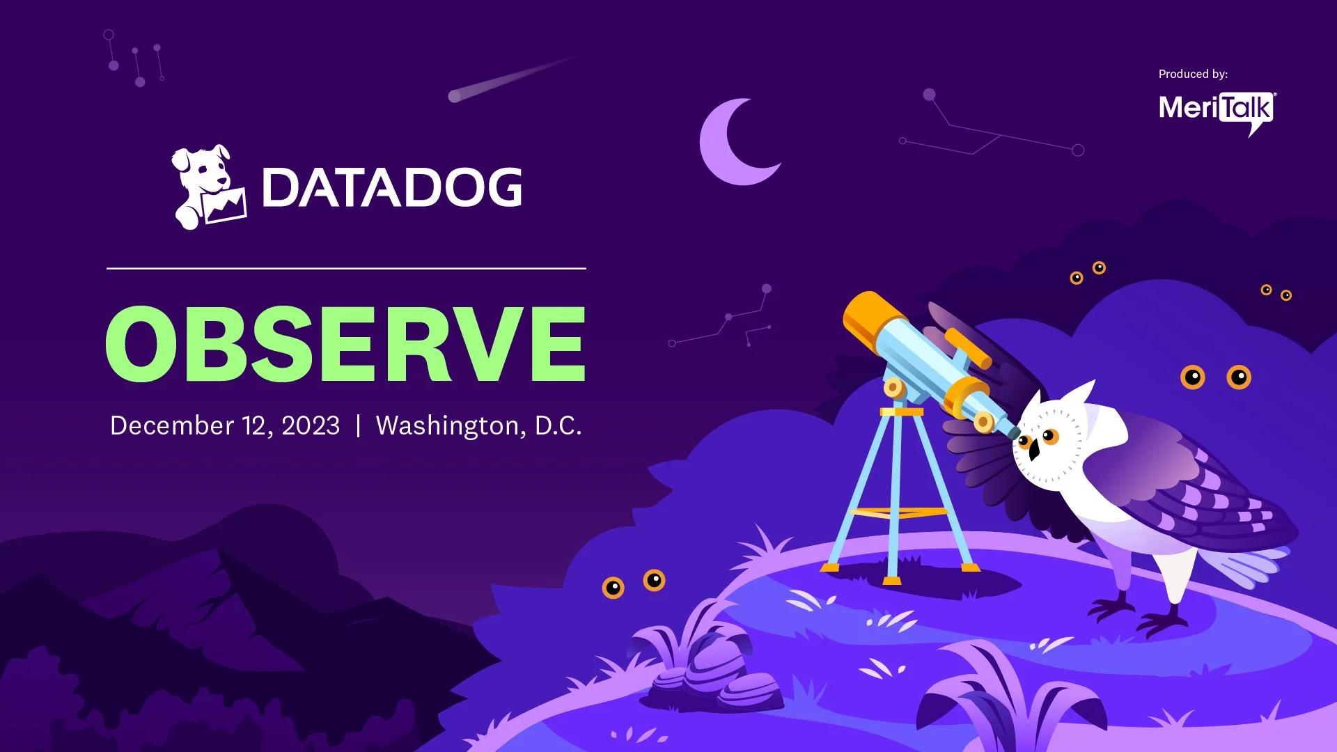
Telescopic Insight: For my third concept, I illustrated an owl intently gazing into a telescope. The owl, a traditional symbol of wisdom and keen sight, embodies what is needed for effective observability. The telescope represents the tool that allows for a magnified, focused view, enabling the observer to see beyond the immediate and see the broader patterns and connections within a data ecosystem. This concept brought a sense of precision and strategic insight to the forefront.
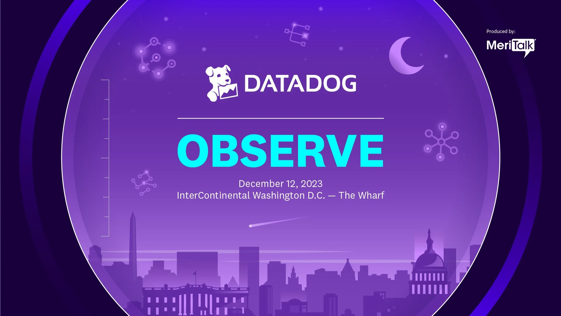
The final creative concept featured a view from within a telescope, looking out onto the iconic Washington D.C. skyline where the event took place. Hanging in the night sky above the cityscape, custom illustrations representing the core pillars of observability seamlessly came together:
Unified Data & On-Premises Systems
Hybrid Environments & Cloud Integration
Proactive Monitoring
This hero concept masterfully married all of the individual technical illustrations into one striking, cohesive graphic, providing the ultimate visual versatility needed to anchor the entire event branding across every touchpoint.
Final Concept
Post-event deliverables
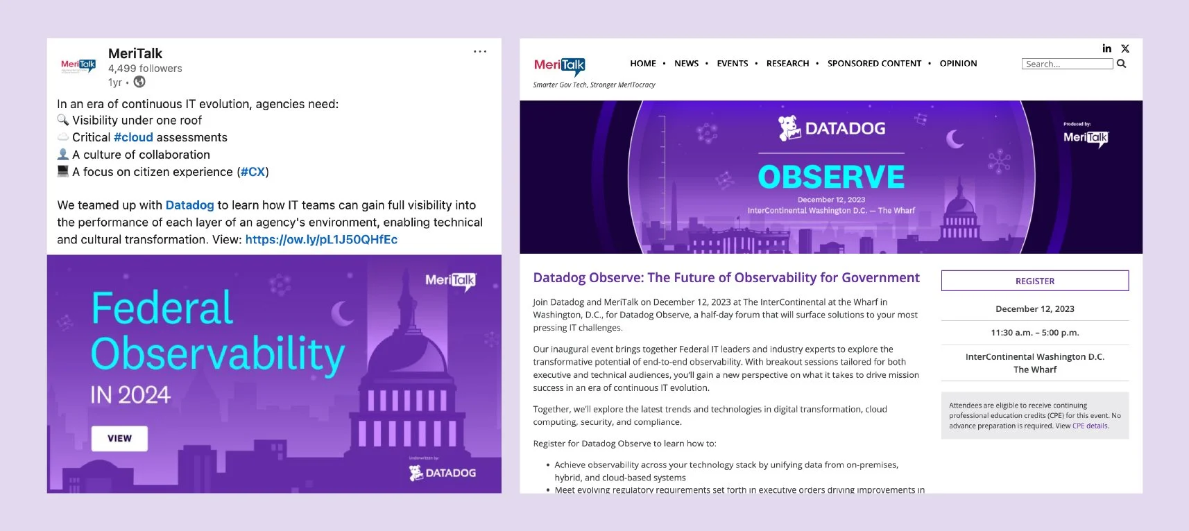
Following the conclusion of OBSERVE, the team and I at 300Brand shifted focus to post-event engagement—transforming the conference's key takeaways, attendee metrics, and main-stage insights into digestible, high-impact retrospective content.
Our strategy was to extend the lifecycle of the event by packaging complex data findings into highly shareable, visually consistent formats. Key deliverables included:
Executive Wrap-Up Infographic: Designed a comprehensive infographic highlighting critical event data points and impactful quotes from the keynote speakers.
Event Sizzle Video: Produced a dynamic, fast-paced video recap synthesizing the event's energy alongside its core data highlights.
Spin-Off Webinar Session: Developed the visual assets and content framework for an in-depth follow-up webinar session, allowing attendees to dive deeper into the technical topics discussed on-site.
Result
Putting together a massive visual ecosystem for OBSERVE was all about making complex, heavy tech concepts feel human, approachable, and exciting to look at. From that initial telescope concept overlooking the D.C. skyline to the post-event infographic and videos my team and I built out, the design style held everything together beautifully. It was fun to see the illustrations scale so seamlessly from tiny attendee badges up to on-site venue installations, helping create a memorable experience for everyone who walked through the doors.